Developing a custom content editor app - 5 UI
|
This page has been created for the Magnolia 5 UI framework. For the 6 UI framework page, see Developing a custom content editor app instead. |
This page describes how to develop a custom content editor app based on the Magnolia Content editor.
Before you start
This section mentions what you should be aware of before creating an implementation of the content editor.
Understanding the content model: block, composition
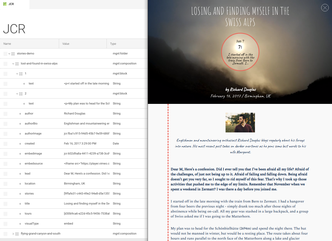
A block is a well-defined page section which, together with other blocks and additional meta information, can form a single content composition.
In the context of the content editor app, each item (e.g. a story in the stories-app) is a composition of N blocks of editable content, such as headings and paragraphs, complemented by meta information such as the required fields for the lead and title of the story:

Required node types
The content editor UI expects nodes of the type mgnl:composition and
mgnl:block. These node types are defined in the file
content-editor-nodetypes.xml which resides in the
magnolia-content-editor submodule.
Hoewever, registration of these node types is handled by the
stories-app or the article-editor via the
XML-based
module descriptor.
Dependencies on the content editor modules
In any case, your implementation of the content editor depends on the following modules:
-
magnolia-content-editor -
magnolia-block-api -
magnolia-block-templating
Besides the requirement for these base modules, you must also ensure
that the system registers the required node types.
If your custom content editor is created with a light module, your
bundle must contain either the stories-app or the article-editor
module. If created with a Magnolia Maven module, you can register the
node types within your custom module.
|
If you are using a preconfigured DX Core webapp or bundle (see
the
list of preconfigured Magnolia bundles), it already contains the
|
Read Content Editor module - Installing for a deeper understanding of the dependencies between the content editor submodules.
Workspace
To store new content items with your custom content editor, you can use
-
the
storiesworkspace provided by thestories-appmodule, -
the
articlesworkspace provided by thearticle-editormodule, -
or a custom workspace defined by your custom module.
Defining a custom content editor app
Developing a custom content editor app is similar to creating a
content app because it is also based on
the info.magnolia.ui.contentapp.ContentApp app class.
|
You can build your custom content editor app within a light module. |
Here is an overview how to define a content editor app:
-
Create a YAML app descriptor with its subapps.
-
Make sure the
contentConnectoris using themgnl:compositionnodetype. -
Specifiy the
contentDefinitionwith the outline and the blocks section.
Creating the descriptor and subapps
Create a YAML app descriptor.
Typically, you need at least the following two subapps:
-
The browser subapp. Use a regular browser subapp class
info.magnolia.ui.contentapp.browser.BrowserSubApp. -
The editor subapp, which is a variant of the detail subapp. It implements content editor’s
info.magnolia.editor.app.ContentEditorSubAppDescriptorclass (see also ContentEditorSubApp descriptor).
The editor subapp must also implement theActionDefinitionof the Content Editor module.
actions:
  close:
    class: info.magnolia.editor.action.CloseContentEditorActionDefinition
  save:
    class: info.magnolia.editor.action.SaveContentActionDefinition
  saveAndPublish:
    class: info.magnolia.editor.action.SaveContentActionDefinition
    onSuccessAction:
      class: info.magnolia.ui.framework.action.ActivationActionDefinition
      command: activate
Using the mgnl:composition nodetype in the contentConnector
Set the mgnl:composition nodetype for the
contentConnector
property in the subapp
descriptors of your content editor:
contentConnector:
  includeProperties: false
  workspace: <workspace-name>
  rootPath: /
  defaultOrder: jcrName
  nodeTypes:
    - icon: icon-node-content
      name: mgnl:composition
      strict: true
    - icon: icon-folder-l
      name: mgnl:folder
strict: truecontentConnector:
workspace: <workspace-name>
nodeTypes:
- icon: icon-node-content
name: mgnl:composition
strict: true
- icon: icon-folder-l
name: mgnl:folder
strict: trueInstead of <workspace-name> use stories, articles or the name of
your custom workspace.
Setting the contentDefinition properties
Add the contentDefiniton node to your editor subapp’s descriptor and
define in it what content is allowed (i.e. editable).
You must specify outlineFields, initialBlock, defaultBlock and
linkableApps.
outlineFields
With outlineFields you define the static, structured information which
you want on every content item.
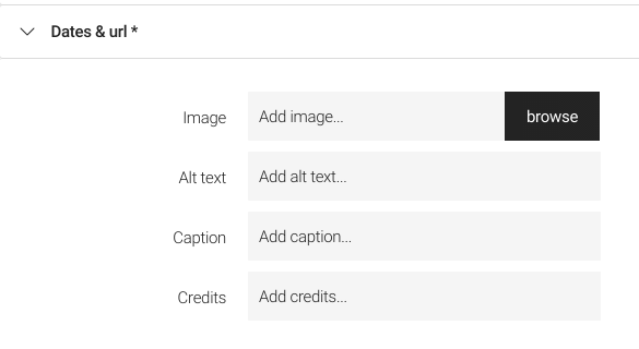
The example below has the following properties: title, lead,
image, created, author and jcrName.
blocks
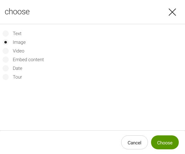
This property defines the block types that are allowed.
Example definition of allowed blocks
blocks:
  - text
  - image
The Content Editor module comes with four predefined types of block you
can use in your editor: text, image, video and externalLink. You
can also
define
your own content block(s).
initialBlock
Specifies what will be created as the initial, automatically added block when creating new content (or when no block is available).
Example definition of the initialBlock
initialBlock: text
Example definition of the initialBlock
initialBlock: image
defaultBlock
Defines the block type that will be selected by BlockPickerField.
Example definition of the defaultBlock
defaultBlock: image
Example definition of the defaultBlock
defaultBlock: text
linkableApp
Defines the app(s) whose resources you can link to from the
text
block.
Example definition of the linkableApps
linkableApps:
  - pages
  - assets
  - contacts