Compatibility App Launcher layout definition
The new App Launcher layout organizes apps into groups and defines what the groups look like. As explained in the migration guide, there are two ways to configure the new design. We describe the compatibility approach in which you have the new UI, but your groupings remain the same on this page.
|
The definition of apps and groups has not changed in the compatibility layout. You can find the layout configuration in |

Compatibility layout example definitions
You can configure the App Launcher compatibilityLayout via the /admincentral/config.yaml file in the Resources Files app, and you can decorate the config file.
|
You can only use YAML to configure the App Launcher for the |
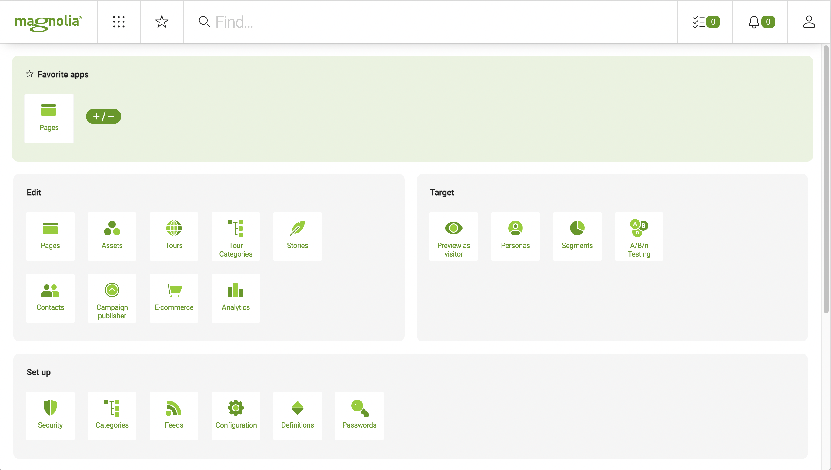
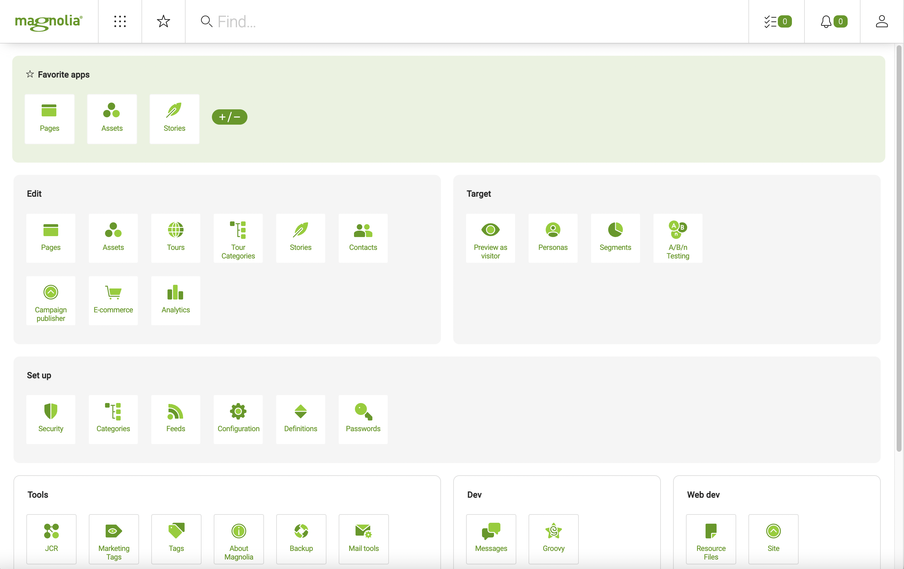
In the example YAML below, the top row has two columns for the edit and target groups in the default layout example below. The next row has just one column for the manage group. And the third row has three columns for the tools, dev, and stk groups (see App Launcher properties for more information about those properties).
Suppose you have configured custom groups in a version of Magnolia earlier than 6.2.22 and use the default compatibility layout with them in 6.2.22 or higher. In that case, you must check that your compatibilityLayout configuration and modify it appropriately, adding or removing groups as required.
|
compatibilityLayout:
  rows:
    - groups:
        - edit
        - target
      cssClass: editor
    - groups:
        - manage
      cssClass: editor
    - groups:
        - tools
        - dev
        - stk
      cssClass: developer
compatibilityLayout Properties
| Property | Description |
|---|---|
|
required The |
|
required List of app groups. |
|
required App group name. For example, a group called content is specified by |
|
required Defines a group’s background color. There are two possible values: |