Dialog definition - 5 UI
Deprecated
|
This dialog definition has been deprecated since Magnolia 6.0. It is part of the Magnolia 5 UI framework. For the updated implementation, see Dialog definition for Magnolia 6 UI instead. |
Dialogs are used for content entry. A dialog defines the editable content properties of a template. Pages, area and component templates can all use dialogs.
The create-page and create-component commands in the
Magnolia CLI create basic dialog definitions
automatically.
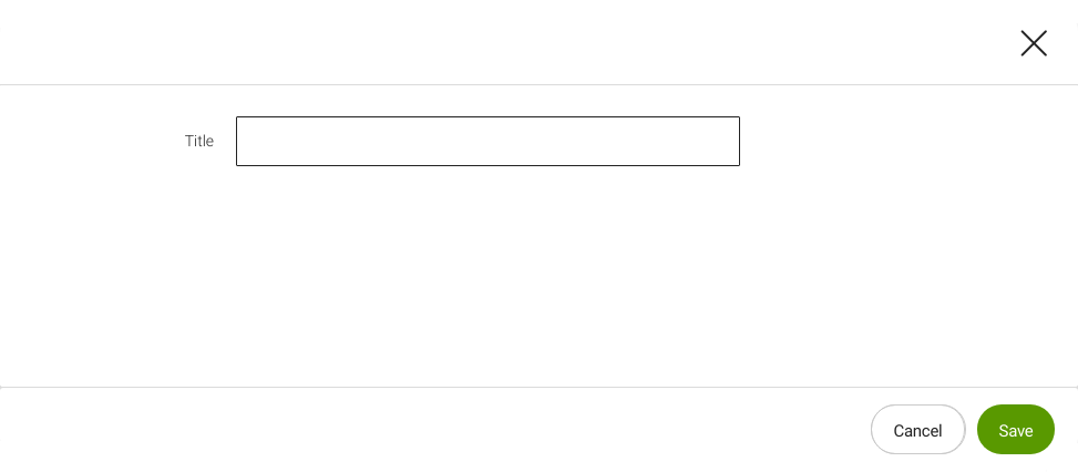
A dialog is basically an HTML form with input fields for each content property. Editors type content into the fields and the dialog saves it in the repository.
The functionality of each field in a dialog is provided by a field definition class that allows the editor to perform a task such as enter text, upload an image, select a date etc. Fields are assembled into tabs and tabs into dialogs.
All dialogs used throughout the system are configured in the same way. For example, the configuration of dialogs used in apps and components is the same.
Dialog properties
At minimum a dialog definition must have a name and has to contain a
form and actions.
Here’s what the configurations do:
-
Form definition: Defines the tabs and fields in the dialog. It determines what content users can enter into the dialog.
-
Action definition: Defines how the form is submitted. Each action definition displays as a button in the dialog. Action definitions control what happens when a user clicks a dialog button. Typical dialogs have save and cancel actions.
Example: Simple dialog definition
YAML file JCR node
form:
  tabs:
    - name: tabText
      fields:
        - name: title
          fieldType: text
          label: Title
actions:
  commit:
    class: info.magnolia.ui.dialog.action.SaveDialogActionDefinition
    label: Save
  cancel:
    class: info.magnolia.ui.dialog.action.CancelDialogActionDefinition
    label: Cancel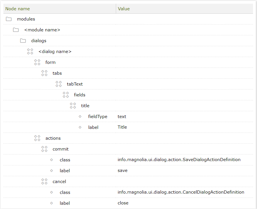
| Node | Description |
|---|---|
|
required Arbitrary node name. Typically matches the template it edits. For
example the component definition node and dialog definition node for a
link component could both be named |
|
required Contains a form definition, which defines the fields where content is entered. |
|
required Contains action definitions which define how the data is submitted. The actions are rendered to users as buttons. Typically you need at least save and cancel actions. |
|
optional Modality
level defines how intrusive the dialog is. Valid values are |
|
optional Allows you to configure secondary actions. |
|
optional, default is
Click the expand/collapse button in the top right corner to toggle between the wide and normal (720px) modes. |
|
optional A property that sets the dialog’s caption. The value is ignored if the The value can be literal such as |
|
optional Allows you to set the dialog’s caption dynamically through a property
holding the preferred value for the caption, for example through the
If no The
|
Location of dialog definitions
| YAML file path | JCR node path in config workspace | |
|---|---|---|
Dialog definition |
|
|
Referencing dialogs
Templates reference dialog definitions in their template definition.
This is how the system knows which dialog to associate with the
template. Page, area and component templates reference dialogs in the
same way by using the dialog property.
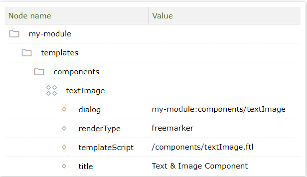
Example: A component definition that references a textImage dialog.
YAML file JCR node
dialog: my-module:components/textImage
renderType: freemarker
templateScript: /components/textImage.ftl
title: Text & Image Component| Node name | Value |
|---|---|
my-module |
|
templates# |
|
components# |
|
textImage# |
|
dialog# |
my-module:components/textImage |
renderType# |
freemarker |
templateScript# |
/components/textImage.ftl |
title# |
Text & Image Component |
| Property | Description |
|---|---|
|
optional Dialog definition ID in The ID has two parts, separated by a colon:
|
Using dialogs in templates
Dialogs are most commonly used for content entry in components. This is where the bulk on content is entered. But dialogs are also useful for page and area templates. Here are a few suggestions:
-
Page dialogs:
-
Content entry: Use the dialog for content entry that is not necessarily rendered on the page. For example, to enter a meta title and description that is injected into the
<head>element, or a page excerpt for use in teaser components on other pages. -
Navigation: Set up a field to mark the page for inclusion in or exclusion from navigation. You could also define browser header and tab titles.
-
Information: Page dialogs can provide editors with useful information. For example, the Content Dependencies module includes a generic tab that collects page dependencies such as other pages and assets. This information is useful when deleting a page.
-
-
Area dialogs: While most areas contain components, dialog content can be rendered by the script in
noComponentareas.
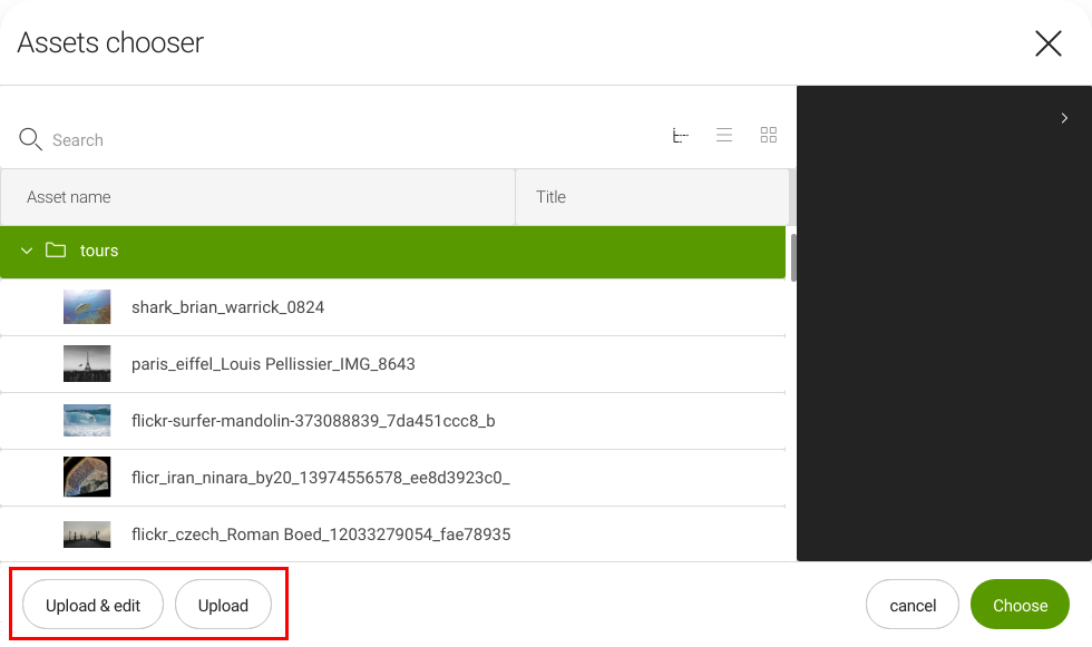
Configuring secondary actions
The actionArea node lets you provide additional actions and specify a
renderer, if required. You need a renderer when the action requires more
than just a button (for instance for an upload action).
The choose dialog in the Assets app - 5 UI is an example. The dialog allows editors to upload assets to the DAM while working in other apps.
The configuration is in /modules/dam-app/apps/assets/chooseDialog:
| Property | Description |
|---|---|
|
optional A secondary action area in the bottom left corner of the editor. Contains the action area configuration. |
|
required Add subnodes to match the secondary actions defined in the |
|
required Secondary action name. |
|
optional Define a subnode for each action which requires its own renderer. |
|
required Name of the secondary action. |
|
required A renderer class if the secondary action requires one. Must implement
|
Reusing configuration
Magnolia provides mechanisms to reuse dialogs or more general said to reuse configuration items. See Reusing configuration.