Analytics Connector Pack
Measuring and improving the performance of your website is a universal requirement. The Analytics Connector Pack allows you to connect third-party web analytics tools such as Adobe Analytics, Google Analytics and Matomo (Piwik) to Magnolia. Editors and marketers can build their own widgets (charts) and dashboards dynamically in the user-friendly Analytics app UI.
The typical scenario for using the Analytics Connector Pack is:
-
Track metrics such as visitors and sessions on your Magnolia site using the third-party tool of your choice.
-
Use the Analytics Connector Pack to fetch the analytics reporting data collected by the third-party tool.
-
Build and display user-friendly widgets directly in the Magnolia Analytics app.
With the Analytics Connector Pack, marketers and authors can make data-driven decisions about their content without switching tools.
Analytics connectors
Your Magnolia administrator can configure the connection details of a third-party web analytics tool, such as the URL and authentication. The Analytics framework can then retrieve the analytics data you want, typically in JSON format.
Magnolia provides out-of-the-box connectors to:
-
Adobe Analytics
-
Google Universal Analytics (UA)
-
Google Analytics 4 (GA4)
-
Matomo
Your administrator can also configure a custom connector to another third-party tool.
Analytics framework
The Analytics Connector Pack provides a generic framework to retrieve the web analytics data from the connected third-party tools.
The framework provides a default implementation to connect to the extensive amCharts data visualization library, which provides user-friendly JavaScript-based interactive charts.
Analytics app
The Analytics app enables editors and marketers to build dashboards and widgets, or charts, to view analytics related to their content within Magnolia. By having access to key analytics in the UI, you can make faster data-driven decisions about your content.
Magnolia provides an out-of-the-box dashboard of sample metrics about your Magnolia installation to illustrate what can be done. The example shows a pie, bar, line and word cloud chart. The charts look and feel like an integral part of the Magnolia user interface.
- NOTE
-
The demo dashboard shows chart types that are not provided out-of-the-box and required additional configuration to create. The demo dashboard also shows a customized pie chart where the number of labels has been reduced.
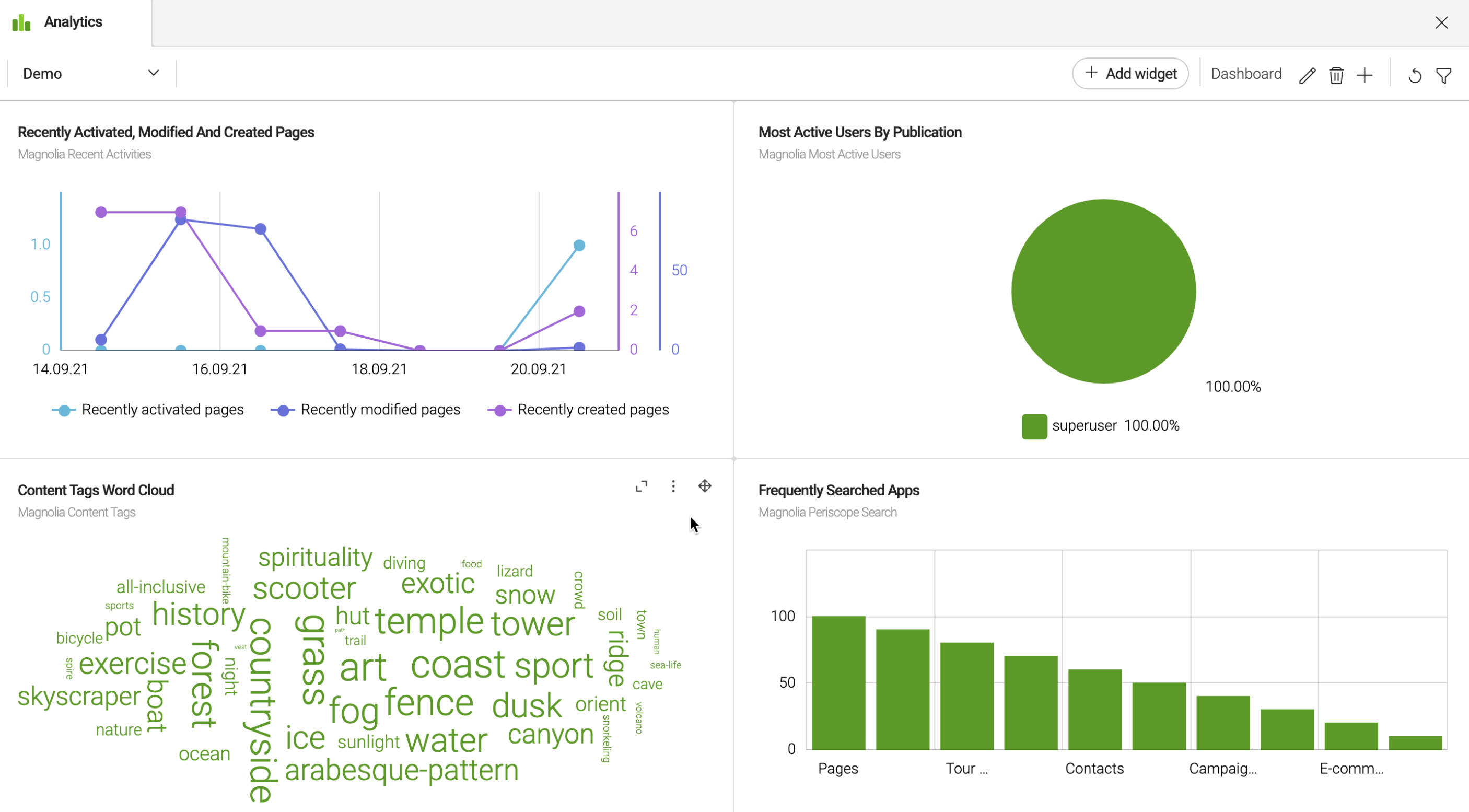
| The sample charts in the demo dashboard have been enhanced using light development. For example, not all chart types or customization in terms of chart colors or labeling are available using the Analytics app UI alone. See the Analytics module for light development configuration details. |
Build your own dashboards and widgets
Create and update your own dashboards by adding widgets. Widgets are charts that display data from one of the out-of-the-box connectors — Adobe Analytics, Google Analytics, Matomo— or from any custom connectors to other third-party analytics data providers that your administrator has configured.
Use the Analytics app user-friendly interface to define specific charts with metrics that are important for you. You can change your dashboard layout and drag and drop widgets around your dashboard as you require.
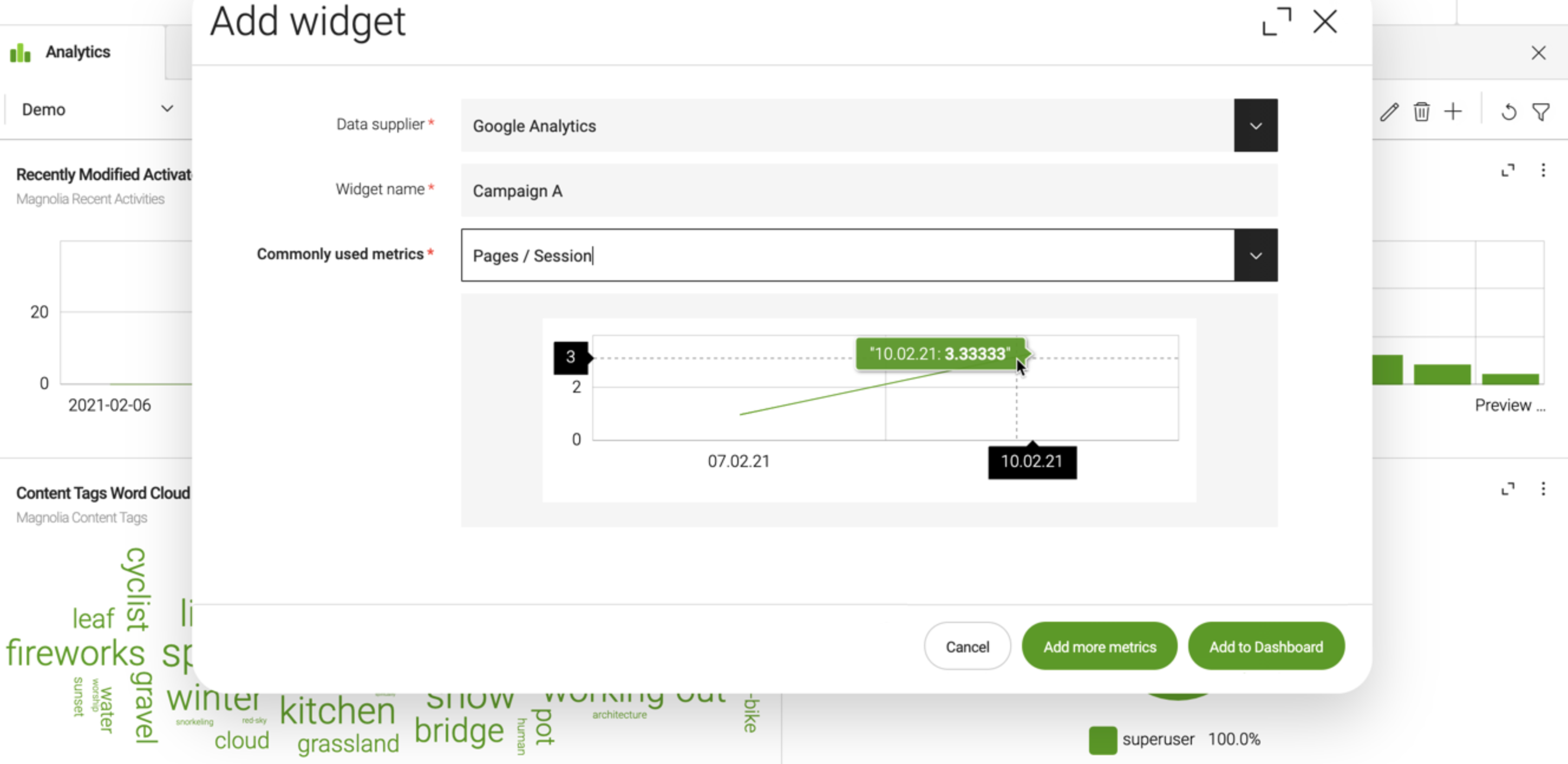
Commonly used metrics out-of-the-box
To help you get started, Magnolia provides common metrics that every analytics tool (GA, Adobe, Matomo) supports ready to use in your widgets.
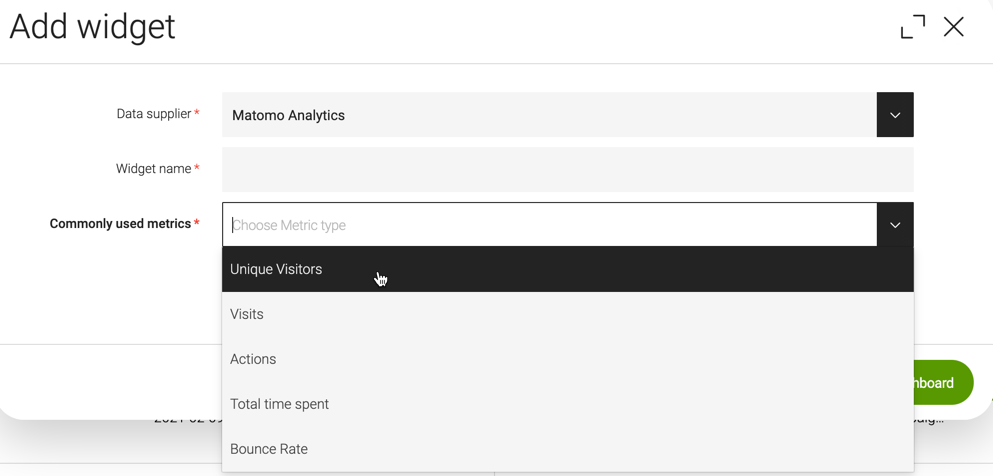
Advanced widgets
If the commonly used metrics do not cover your use case, you can explore your data and add more metrics from the Analytics app.
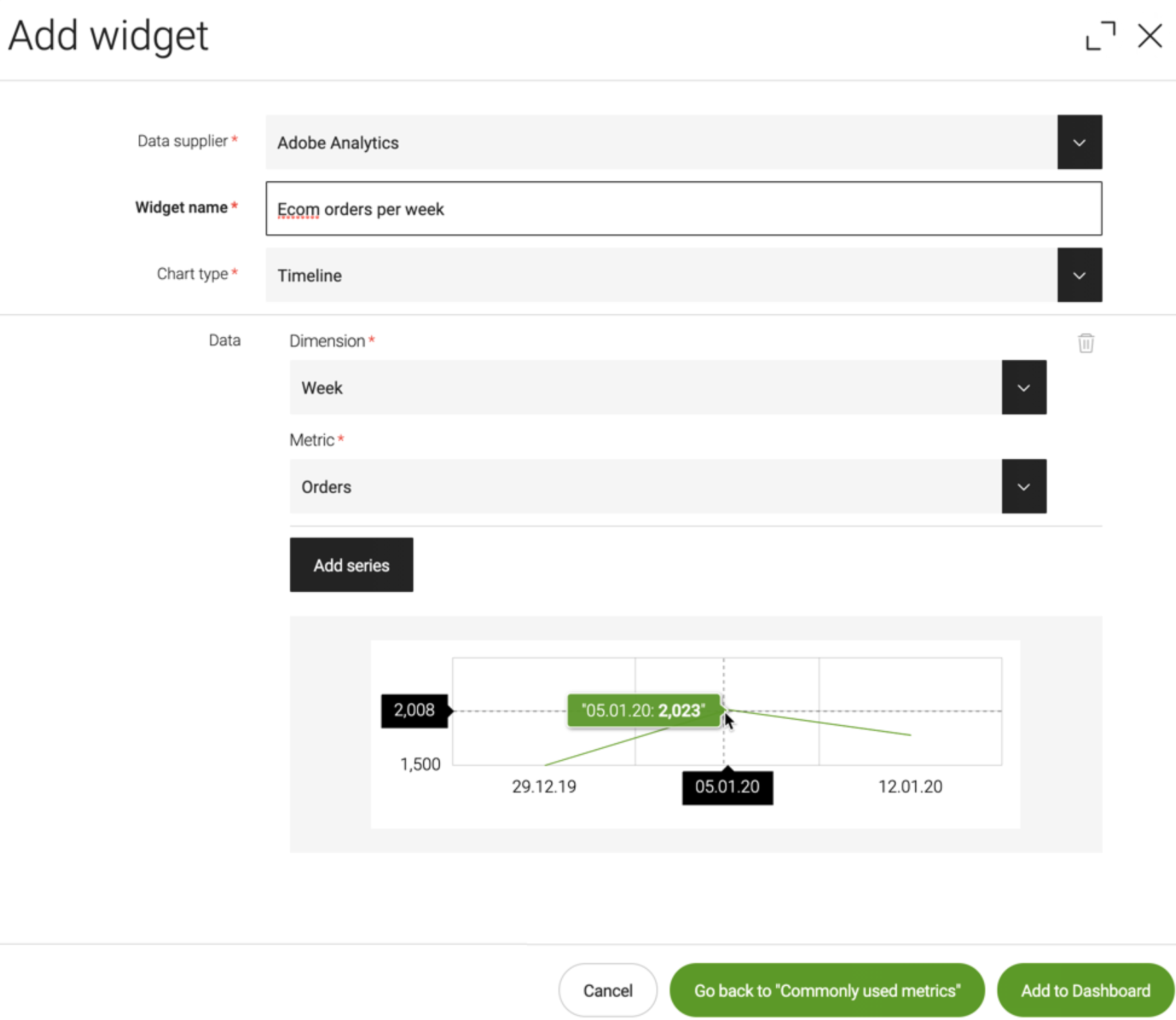
The Add widget dialog expands to allow you to choose several additional chart types and select one or more series of dimension and metric combinations. A preview of the selected data is shown directly in the dialog as you build your widget.
In the case of internal data suppliers, such as file-based data supplier that fetches data from a JSON file, a JSONPath evaluator is also provided to help you by displaying the resulting JSON for each expression.
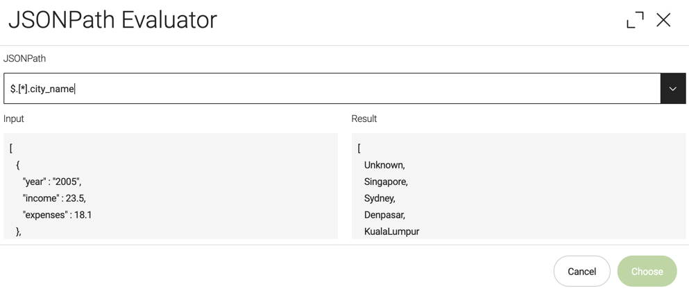
| Advanced widgets give you full access to your analytics data but not all customization possibilities in terms of chart types, colors or labeling for example. Developers can configure advanced custom charts using light development. |
Filter your analytics data
Developers can define filters to drill down into the data displayed in the charts that are configured. When set, each filter is applied to all the charts in the dashboard simultaneously. For example, if you set a filter to display a given time range, all the charts display data for that time range.
Analytics where you need them
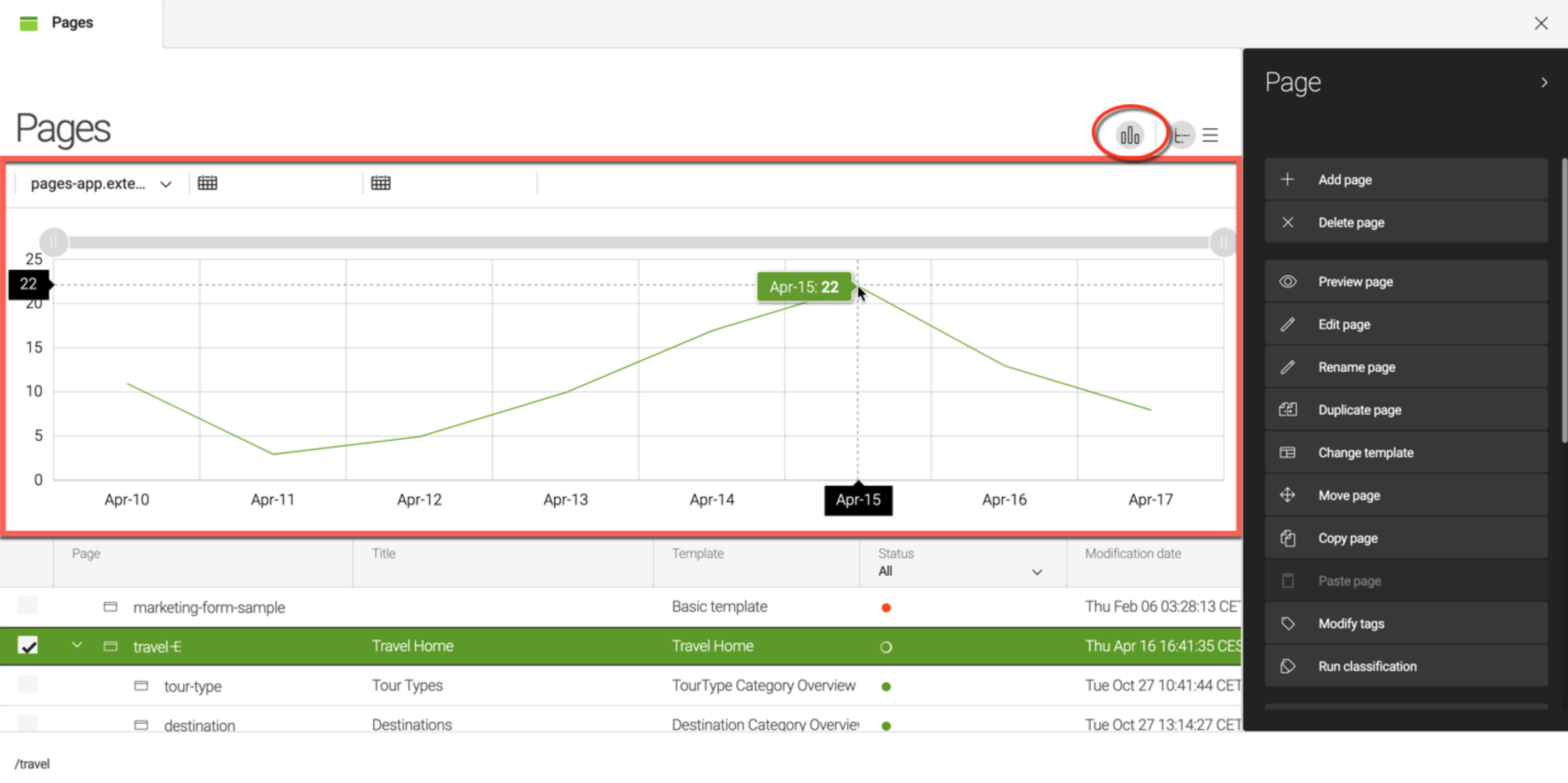
In addition to viewing analytics in the dedicated app, you can display them next to the content they apply to in IUX (Integrated User eXperience) slots.
IUX slots are places in the AdminCentral UI where elements from integrated applications or other Magnolia content apps can live. Analytics elements such as charts and widgets add value to the user’s workflow inside Magnolia. We pull in data from adjacent applications and content apps and display it in the right places so that users do not need to switch from application to application.
The first slot, introduced in Magnolia 6.2, is a wide horizontal slot at the top of content apps. Developers can configure this slot to show page analytics provided by the Analytics module. For example, in this screenshot, users can select a page to see common metrics from the connected analytics source directly in the Magnolia UI.
