Component personalization
This page describes component personalization, adapting the content of a component to the visitor according to his or her personal preferences, needs and capabilities.
Personalization at the level of components works the same way as page personalization except that you are personalizing a smaller item.
![]() Magnolia Hands on Demo:
Personalization (April 19, 2022)
Magnolia Hands on Demo:
Personalization (April 19, 2022)
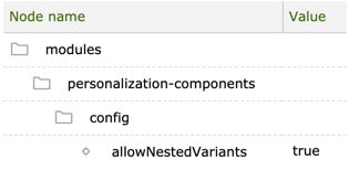
You can personalize a page and its components at the same time. The
feature is disabled by default. To enable it, set
/modules/personalization-components/config/allowNestedVariants to
true.
Personalizing a component
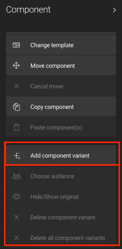
Component personalization is possible through the following actions in the Component action bar:
-
Add component variant
-
Choose audience
-
Hide/Show original
-
Delete component variant
-
Delete all component variants
Adding a variant
If the selected component hasn’t been personalized yet, only the Add component variant option will be available:

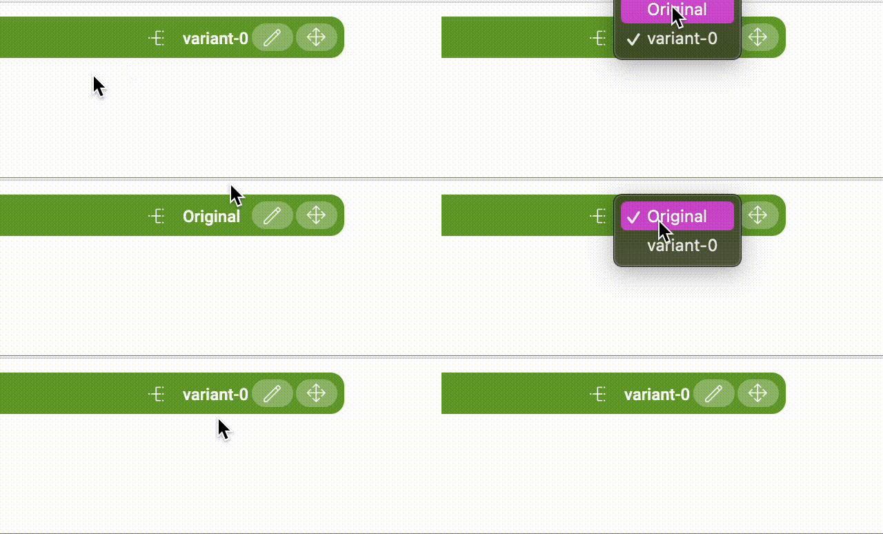
To add a new variant to a component, click Add component variant. The
variant icon ![]() and the
default label variant-0 appear in the component bar:
and the
default label variant-0 appear in the component bar:
![]()
The original component content is renamed to Original. Click on the
variant-0 label to view and access the list of variants and the
original from the pop-up menu that appears.

If not associated with any target audience, the newly added variant of the component is named automatically by Magnolia (variant-0). Once the target audience is defined and associated with the variant, the name of the audience is displayed in place of the automatically generated name. This version of the component will be displayed to page visitors if no audience trait can be matched with the personalization properties assigned to the other variant(s) of the component.
Adding a variant to a component will affect its publishing status as well as the publishing status of its parent area and parent page: all of these are changed to modified (yellow) because creating a variant is considered an edit action on the component.
When a page has content variants for some of its components, the variants icon ![]() appears in the top bar of the page in the Edit and Preview views and next to the name of the page in the page tree view.
appears in the top bar of the page in the Edit and Preview views and next to the name of the page in the page tree view.
Editing a variant
After a variant has been published, you will see the green circle in the status column in the Pages app.

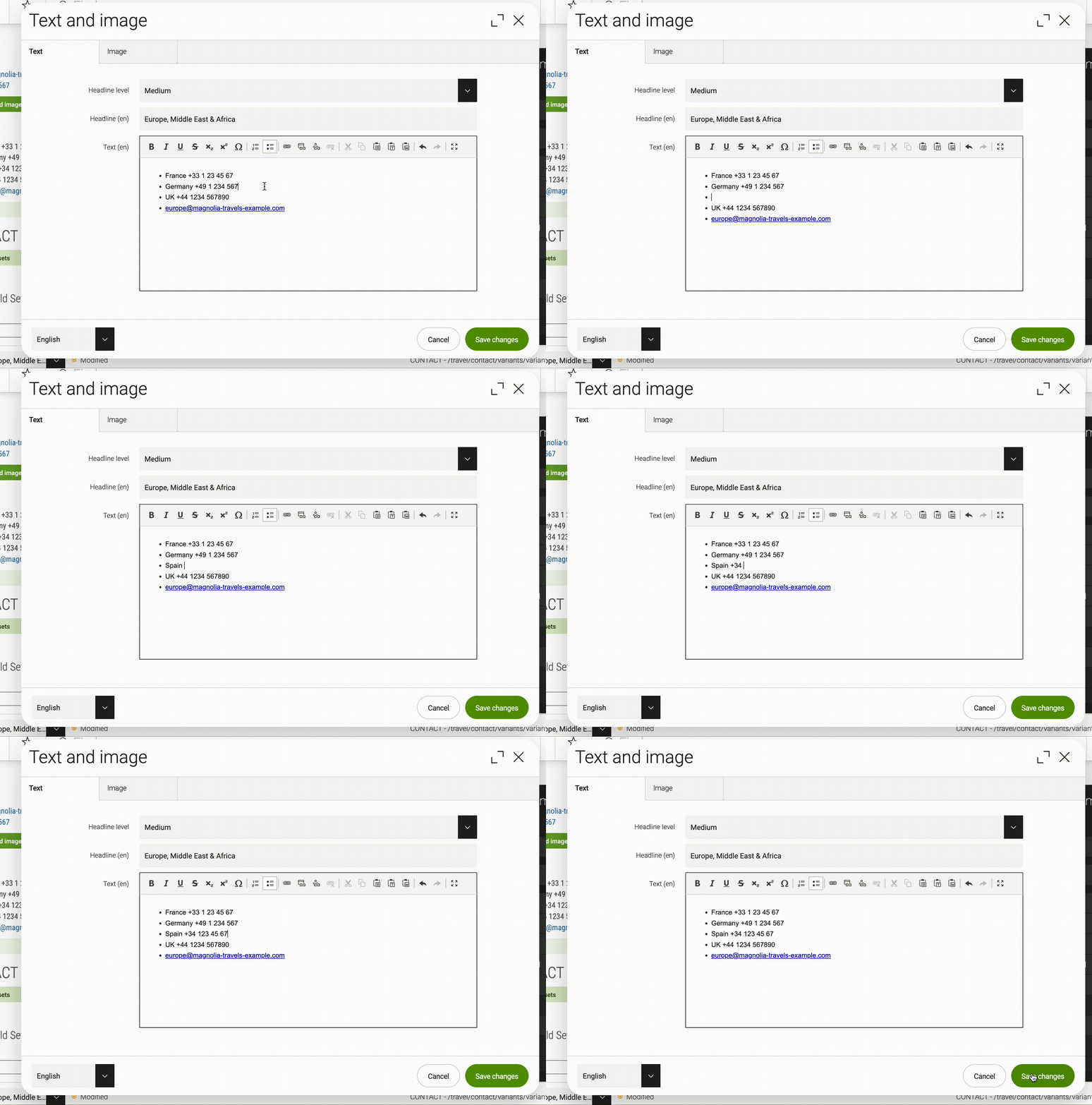
Let’s say we want to add another phone number to the contacts in our EMEA variant. We open the contact: Europe, Middle East & Africa variant, go to the component we want to modify, click on the edit icon ![]() , add the new number, and Save changes.
, add the new number, and Save changes.

In the component itself, we can see a yellow circle that tells us that this component has been modified.

Back in the Pages app, the publishing status for the variant we have just edited also turned from a green circle to a yellow one. This means that the modification needs to be published.

To do so, select the modified variant and click on Publish in the action bar. This will open a dialog where you should insert a comment briefly describing the changes made to the variant, and then click the green Publish button
Now, these changes are pending approval by the editor. Once they are approved and published following the workflow, the publication status changes to a green circle once again.
Choosing an audience
Select the Choose audience option in the Action bar to choose the target audience for a component variant. Selecting a component variant is a prerequisite to choosing an audience for the variant.
it is not possible to choose an audience for the Original
version of the component.
|
Hiding the original
The Original content of a component can be marked as `ORIGINAL –
HIDDEN''. When marked as hidden, the content associated with the
`ORIGINAL will only be visible in the page Edit view.
Why hide the original? Hiding the original can be useful in a scenario in which the content is exclusive, targeting a particular audience. If no variants match, the original (fallback) content will be hidden. To hide/show the content of a component, select the Hide/Show original option in the Action bar.
Changing the template of a personalized component
You can serve different content to different audiences by changing the template used in a personalized component. This enables you to serve text to one audience, an image to another audience, video to a third audience and so on. To change the template of a component variant, select the variant you want to change in the component bar and click Change template in the Action bar. A dialog opens where you can choose the template you want to apply to the component variant.
Deleting a variant or all variants
There are three ways to delete a variant:
-
Select the component variant you want to delete in the variant pop-up menu and click on Delete component variant.
-
Delete all component variants.
-
Delete the component itself. However, in this case, also any other variant of the component is also deleted. This deletion can only be undone by restoring an earlier version of the page.
After the deletion of the component, the publishing status of the parent area and the parent page change to modified (yellow) because deleting a component is considered an edit action on the page.
Permissions
Disable personalization in a component template
Set the
personalizable
property to false in the component template to disable
personalization. This disables the Add component variant action. You
may disable personalization in components that must display the exact
same content such as legal boilerplate text to all visitors. All
components can be personalized by default.
my-module/templates/components/html.yaml
renderType: freemarker
templateScript: /my-module/components/html.ftl
dialog: my-module:components/html
deletable: false
writable: false
moveable: false
personalizable: false
Grant component personalization permission to a role
Define which roles are allowed personalize components. Name the roles in your area definition.
areas:
  myArea:
    availableComponents:
      myComponent:
        id: my-module:components/myComponent
        permissions:
          write:
            roles: [editors, superuser]
          move:
            roles: [senior-editor, superuser]
          delete:
            roles: [editors, superuser]
          personalize:
            roles: [senior-editor, superuser]